Extract UI Items
Wrap Around Banner
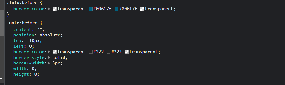
User Interface Discussion
I liked the wraparound look these banner items has. I feel this created a 3D depth to the page and really made it stand out.
The triange used to give it the wraparound effect was created by giving the element a absolute position to the banner and offsetting it. To make it a triangle the coloring used transparency to blend it into the background.
Navigation Button
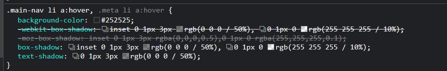
User Interface Discussion
IThe navagation items had a very appealing look to me when they were in a hover state. It was gave a "pressed" button look to the element.
The hover state added a differnt background color and inset the box shadow to give it that dropped into the page button look.
Arrow Selector on Side Menu
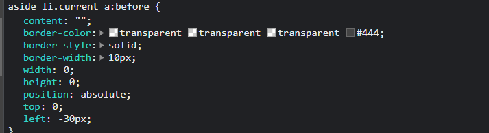
User Interface Discussion
I liked the arrow indicator that followed along on the side menu. It looks nice and follows the design structure of the page. It interacts nicely as you navigate around.
The element is set to display on the current li item selected and positioned away from the list item. It creates a look that it is part of the main content and not a part of the li items. The shape is created using the transparent values.
Shadow Banner
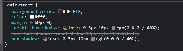
User Interface Discussion
I liked the look of this banner. The shadowing being heavier on the top gave it a feel of light coming from the top perspective.
The inset value was used on the box shadow to give it a feel of being lowered into the page by border shadows. The offset values made the shadow grade from the top to bottom.