Code
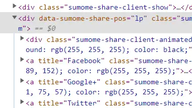
On the Resource page there is a navigation besides the main webpages navigation that directs visitors to the various social sites of the creator. I like the code making it in a fixed position so that as you scroll the menu stays with you.
User Interface - UI
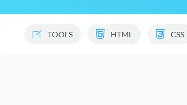
I thought the creator did a good job on his main navigational menu and created it large enough to easily find all of the available optins for you. You do not need to wonder what other category it may be in and its not hid behind an over all fancier navigation.
User Experience - UX
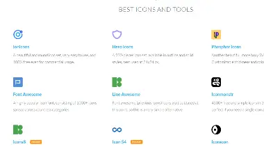
I feel that by this creator sharing so many resources they are really in the best intrest of helping you learn. It is not just one or two resources this creator gives, but many across all different kinds of tools needed. It creates a sense of confidence in a teacher when they share the different tools they use or have found usefull to them along the way.
Summary
The main point of this page is for Jonas to convince you to enroll in his courses, but I find the resource tab the real golden nugget that someone can almost use as a catch all bookmark to find so many resource links in one place. I thought the website was clean, small and to the point, and his code is very simply written and easy to follow when inspecting the page.