Code

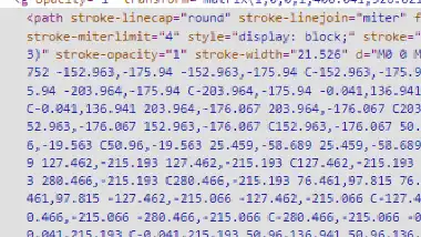
Veerle website has a logo on the home page that has a animation theat swirls colors around when first entering the page. I thought this was a very intersting design. It looks like there is a lot of transform properties mapping out the path and setting all of the colors.
User Interface - UI

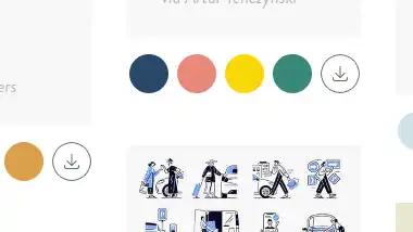
I felt the user interaction with the inspiration page was an amazing idea and made the process simple. The idea itself is great, but coupled with how she created the range of colors and made the code snippet easily downloadable was great for users.
User Experience - UX

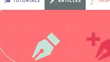
I don't know if this should be a bother, but every time I did this thing I kept thinking about it. Whenever I would enter the tutorial tab and select a tutorial the article tab would now be highlighted on the navigation. If I selected the article tab and selected an article the article tab would stay the focused tab. I feel if I am involved with a tutorial, the tutorial tab should stay highlighted as the focus. Very small detail, but one that while isnt problematic, it did give me an annoyed feeling.
Summary
Overall I liked Veerle's website and thought it fit the "tranquil" feeling it is going for. It was not heavy on content, but I do not feel that it is created for that reason.