Code
Envy Labs has a floating icon added to their navigational bar that I found interesting and unique. It would stay animated and focused on the page that you were currently visiting. It is a SVG file addes as a background and positioned absolute to the anchor for that navigation li.I thought it was a good design aspect that changes nicely when you move around through active pages.
User Interface - UI
I thought EnvyLabs did a great job on their website with their call to actions forms. They are simple and eye catching. They were the main highlight when scrolling to them. They have animation features, which let me know this was a actionalble item compared to static content. This was found on their insights page. They also used a similar interface for signing up for the newsletters.
User Experience - UX

It was a small thing I noticed as revisiting pages time and time again, but whenever I landed on Envy Labs "who we are" section the order had changed of the team. This made me feel very positive of the brands iamge and to meet invoked a sense of trust and care. They did not just highlight the CEO, but by shuffling the profiles it felt like they valued their team as a whole.
Summary
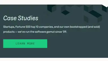
Envy Labs had a well balanced website. It had a lot of transitions to keep the user experience engaging. It gave me a sense of clean, freindly design. Their case study were not too in depth, but enough to help you to understand the benefits partnering with them could bring your organization. Navigation was easy for user to find this case study information, contact information, and information regarding services.